Manthan Thool
Court Vision 3D: Seeing Basketball in a New Dimension
Basketball shot charts are everywhere in sports media, but most people find them hard to read. Flat dots on a 2D court do not show how good a shot really was, and they give no sense of the game as a physical space. Court Vision 3D turns that flat chart into something you can step into.
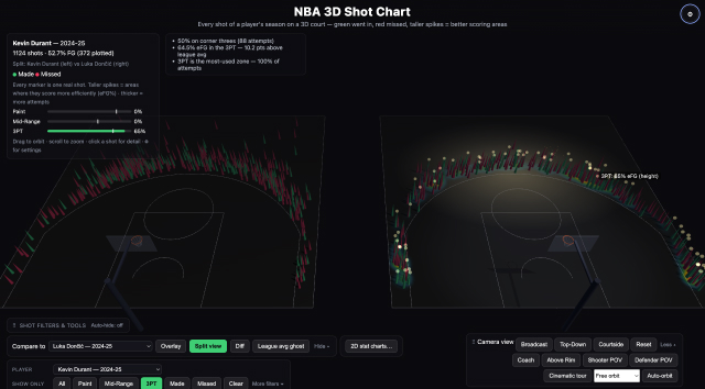
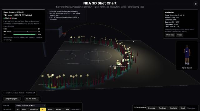
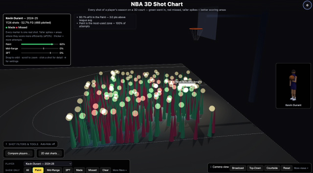
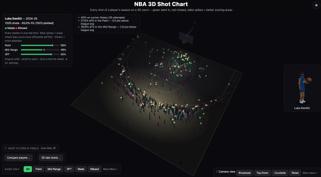
The project takes real NBA shot data and rebuilds it as an interactive 3D scene inside a virtual arena. Every shot becomes a spike rising from the court, its height showing how efficient that shot was and its colour showing whether it went in. Instead of scanning a static image, you can rotate the whole court, zoom into a hot zone, and hover over any shot to see exactly who took it and what happened.
The design was built specifically for non-experts: sports fans, students, and casual viewers rather than analysts. Simple filters let you switch between the paint, mid-range, and three-point zones without needing to understand basketball statistics first. The goal was not to make a more advanced tool for experts, but a more understandable one for everyone else, turning a chart that used to need explaining into one that explains itself.
This prototype is the practical outcome of an MSc research project asking whether interactive 3D visualisation can genuinely make sports data easier to understand and more engaging than the familiar 2D chart, testing that question with real users across two rounds of interviews and hands-on prototype sessions.
Come try it for yourself: rotate the court, chase down your favourite player's shots, and see if basketball data looks different in three dimensions.
Project Link : https://manthanthool28-png.github.io/nba-3d-shot-chart/?datasetKey=luka_doncic_2024-25_regular&colorMode=outcome&palette=default